
2021
Grayson Hill
A hair care brand built for Black women, replacing a Canva template that at least five other businesses were also using with an identity the founder could actually own.
Brand Identity
Beauty
Know More
Grayson Hill was a hair care line for Black women, built by one. The name is two surnames from opposite sides of her family. Everything about the brand was meant to be specific to her, and the logo was the one part that belonged to everybody.
You cannot own a template
Grayson Hill was a hair care line aimed at Black women, created by a Black woman who wanted products she could use herself and a brand she could see herself in. For us, by us, in the most literal sense. The name is two surnames from opposite sides of her family, so the brand carried her history before it carried a single product.
The identity did not match that. The logo had been built in Canva back in 2021, during the stretch when the same handful of templates were circulating everywhere, and we found at least five other businesses running the same one.

Problem
The most personal thing about the brand was its name. The most public thing about it was a logo five other companies were also using.
A template logo is not just generic, it is unownable. Nothing stops the next business from picking up the same file, and nothing stops a customer from having seen it somewhere else first. For a brand whose entire premise was that it was made specifically for its customer, showing up in borrowed clothes contradicted the pitch before anyone read a word of it.
The practical demands were just as real. The mark had to survive on a bottle, work on merchandise, hold its own next to national hair care brands with real budgets, and stretch to cover products that did not exist yet if the line grew. A template does none of that. It is sized for a social post and falls apart everywhere else.

Concept
A monogram simple enough to own, and flexible enough to outlive the first product.
She asked for a monogram, and for once the obvious request was the right one. A monogram drawn from her own family names is the one mark nobody else can lift off a template site, and the simplest form was also the most durable: clean enough to read at the size of a bottle cap, strong enough to hold a shelf.
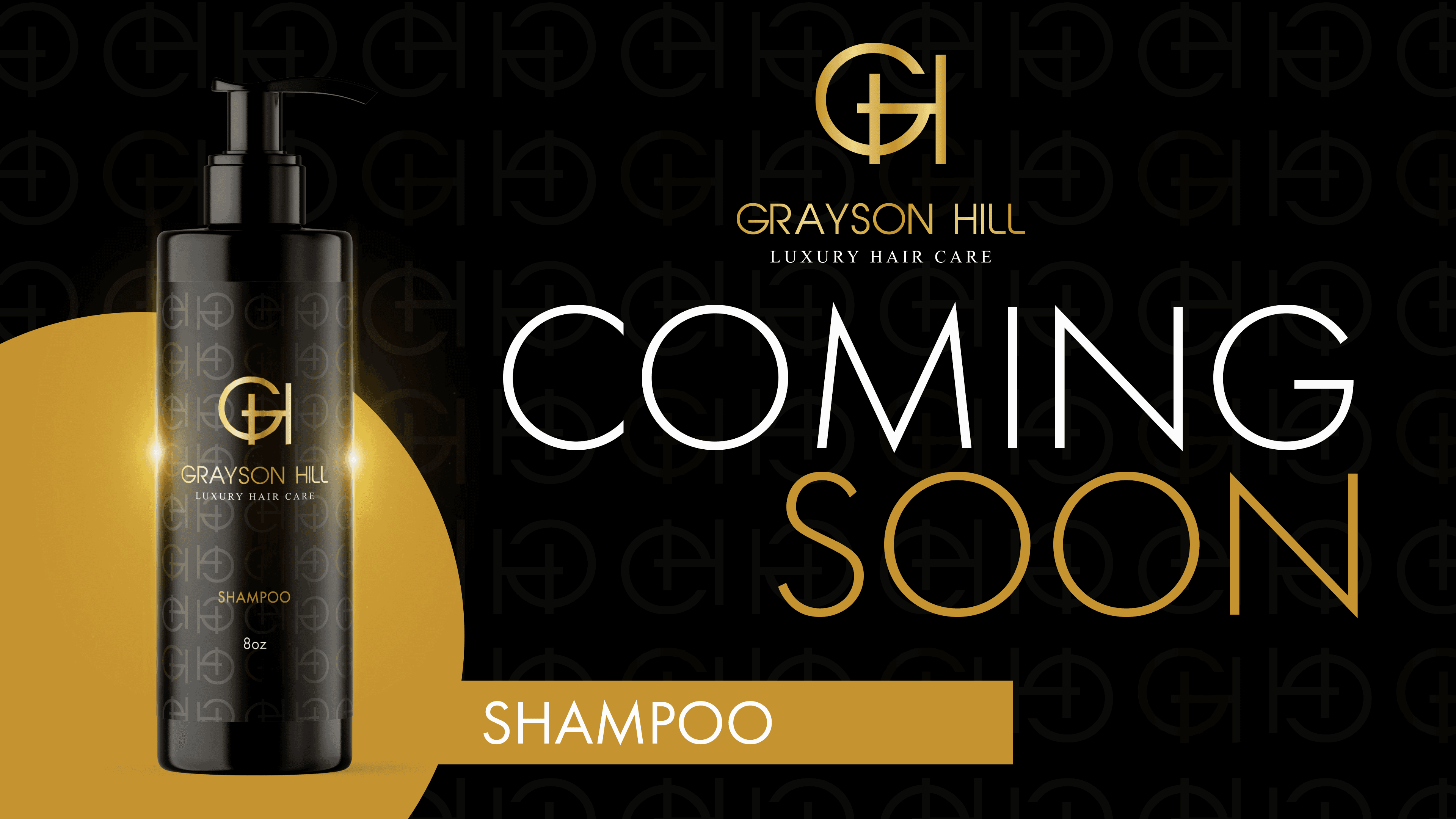
Black and gold set the register. The palette does the work of signalling a premium product in a category where shelf presence decides whether a customer picks something up at all, and the typography stays plain and readable so the name never competes with itself. Nothing in the system depends on a specific product, which is what future proofed it. A new item in the line inherits the brand instead of needing one of its own.

The System
Not a logo. A full brand, ready for a shelf on day one.
The delivery covered the primary logo, a secondary logo, an icon, a repeating pattern, the color palette, the typography system, packaging direction and supporting collateral, built over about three weeks. It was scoped as everything a product brand needs before it launches rather than a mark to be figured out later.
What she ended up owning was not a logo but a brand: specific to her, unavailable to anyone else, and built to compete for attention on a shelf where presentation is most of the decision. Set it beside a national hair care brand and it holds.

More Works


FAQ
01
How much does it cost?
02
What is the process?
03
How do I know you're right for me?
04
Do you offer discounts or packages?
05
Is a deposit required?
06
How many revisions do I get?
07
What files do I receive?
08
Who owns the final files?
2021
Grayson Hill
A hair care brand built for Black women, replacing a Canva template that at least five other businesses were also using with an identity the founder could actually own.
Brand Identity
Beauty
Know More
Grayson Hill was a hair care line for Black women, built by one. The name is two surnames from opposite sides of her family. Everything about the brand was meant to be specific to her, and the logo was the one part that belonged to everybody.
You cannot own a template
Grayson Hill was a hair care line aimed at Black women, created by a Black woman who wanted products she could use herself and a brand she could see herself in. For us, by us, in the most literal sense. The name is two surnames from opposite sides of her family, so the brand carried her history before it carried a single product.
The identity did not match that. The logo had been built in Canva back in 2021, during the stretch when the same handful of templates were circulating everywhere, and we found at least five other businesses running the same one.
Problem
The most personal thing about the brand was its name. The most public thing about it was a logo five other companies were also using.
A template logo is not just generic, it is unownable. Nothing stops the next business from picking up the same file, and nothing stops a customer from having seen it somewhere else first. For a brand whose entire premise was that it was made specifically for its customer, showing up in borrowed clothes contradicted the pitch before anyone read a word of it.
The practical demands were just as real. The mark had to survive on a bottle, work on merchandise, hold its own next to national hair care brands with real budgets, and stretch to cover products that did not exist yet if the line grew. A template does none of that. It is sized for a social post and falls apart everywhere else.
Concept
A monogram simple enough to own, and flexible enough to outlive the first product.
She asked for a monogram, and for once the obvious request was the right one. A monogram drawn from her own family names is the one mark nobody else can lift off a template site, and the simplest form was also the most durable: clean enough to read at the size of a bottle cap, strong enough to hold a shelf.
Black and gold set the register. The palette does the work of signalling a premium product in a category where shelf presence decides whether a customer picks something up at all, and the typography stays plain and readable so the name never competes with itself. Nothing in the system depends on a specific product, which is what future proofed it. A new item in the line inherits the brand instead of needing one of its own.
The System
Not a logo. A full brand, ready for a shelf on day one.
The delivery covered the primary logo, a secondary logo, an icon, a repeating pattern, the color palette, the typography system, packaging direction and supporting collateral, built over about three weeks. It was scoped as everything a product brand needs before it launches rather than a mark to be figured out later.
What she ended up owning was not a logo but a brand: specific to her, unavailable to anyone else, and built to compete for attention on a shelf where presentation is most of the decision. Set it beside a national hair care brand and it holds.
More Works
FAQ
01
How much does it cost?
02
What is the process?
03
How do I know you're right for me?
04
Do you offer discounts or packages?
05
Is a deposit required?
06
How many revisions do I get?
07
What files do I receive?
08
Who owns the final files?
2021
Grayson Hill
A hair care brand built for Black women, replacing a Canva template that at least five other businesses were also using with an identity the founder could actually own.
Brand Identity
Beauty
Know More
Grayson Hill was a hair care line for Black women, built by one. The name is two surnames from opposite sides of her family. Everything about the brand was meant to be specific to her, and the logo was the one part that belonged to everybody.
You cannot own a template
Grayson Hill was a hair care line aimed at Black women, created by a Black woman who wanted products she could use herself and a brand she could see herself in. For us, by us, in the most literal sense. The name is two surnames from opposite sides of her family, so the brand carried her history before it carried a single product.
The identity did not match that. The logo had been built in Canva back in 2021, during the stretch when the same handful of templates were circulating everywhere, and we found at least five other businesses running the same one.
Problem
The most personal thing about the brand was its name. The most public thing about it was a logo five other companies were also using.
A template logo is not just generic, it is unownable. Nothing stops the next business from picking up the same file, and nothing stops a customer from having seen it somewhere else first. For a brand whose entire premise was that it was made specifically for its customer, showing up in borrowed clothes contradicted the pitch before anyone read a word of it.
The practical demands were just as real. The mark had to survive on a bottle, work on merchandise, hold its own next to national hair care brands with real budgets, and stretch to cover products that did not exist yet if the line grew. A template does none of that. It is sized for a social post and falls apart everywhere else.
Concept
A monogram simple enough to own, and flexible enough to outlive the first product.
She asked for a monogram, and for once the obvious request was the right one. A monogram drawn from her own family names is the one mark nobody else can lift off a template site, and the simplest form was also the most durable: clean enough to read at the size of a bottle cap, strong enough to hold a shelf.
Black and gold set the register. The palette does the work of signalling a premium product in a category where shelf presence decides whether a customer picks something up at all, and the typography stays plain and readable so the name never competes with itself. Nothing in the system depends on a specific product, which is what future proofed it. A new item in the line inherits the brand instead of needing one of its own.
The System
Not a logo. A full brand, ready for a shelf on day one.
The delivery covered the primary logo, a secondary logo, an icon, a repeating pattern, the color palette, the typography system, packaging direction and supporting collateral, built over about three weeks. It was scoped as everything a product brand needs before it launches rather than a mark to be figured out later.
What she ended up owning was not a logo but a brand: specific to her, unavailable to anyone else, and built to compete for attention on a shelf where presentation is most of the decision. Set it beside a national hair care brand and it holds.
More Works
FAQ
How much does it cost?
What is the process?
How do I know you're right for me?
Do you offer discounts or packages?
Is a deposit required?
How many revisions do I get?
What files do I receive?
Who owns the final files?