
2025
Excel Vision Consulting
A consulting practice built to fix how other businesses run, branded before it had a single client to point to. With no track record yet, the identity had to carry the argument by itself.
Brand Identity
Consulting
Know More
She asked for a monogram. What she needed was a mark that could make her case before anyone had a reason to trust her.
The mark had to do the job a track record usually does.
Excel Vision Consulting came to me pre-launch, from a founder who had hired me before and came back after seeing my work through a friend I had worked for. She asked for a monogram: sleek, professional without being too serious, nothing complicated or hard to read.
That brief was easy to satisfy, which was exactly the problem with it. What she actually needed was a mark that made an argument on her behalf in the seconds before anyone had a reason to trust her. The whole identity turned on one decision: what to put inside the counter of the C.

Problem
She was selling structure to people who had never met her.
The practice targeted two groups that look different and want the same thing. Startups needed structure built from nothing. Established businesses needed structure that had stopped working fixed. Both hire a consultant on trust, and they extend that trust long before they can evaluate the actual work. She had no client list, no case studies and no referral engine yet. Her identity was not decoration on top of a business. For a while it was going to be the entire body of evidence.
Her brief asked for something clean and legible, and a straightforward interlocked EVC would have checked every box she wrote down. It also would have left her looking like any other consultant with three initials on a card. That is the trap in a monogram brief. Legible is not the same as memorable, and memorable is not the same as credible. A mark that only spells her name puts the entire burden of persuasion back on her, in every room, forever.

Concept
The arrow went where the letterform already had a hole.
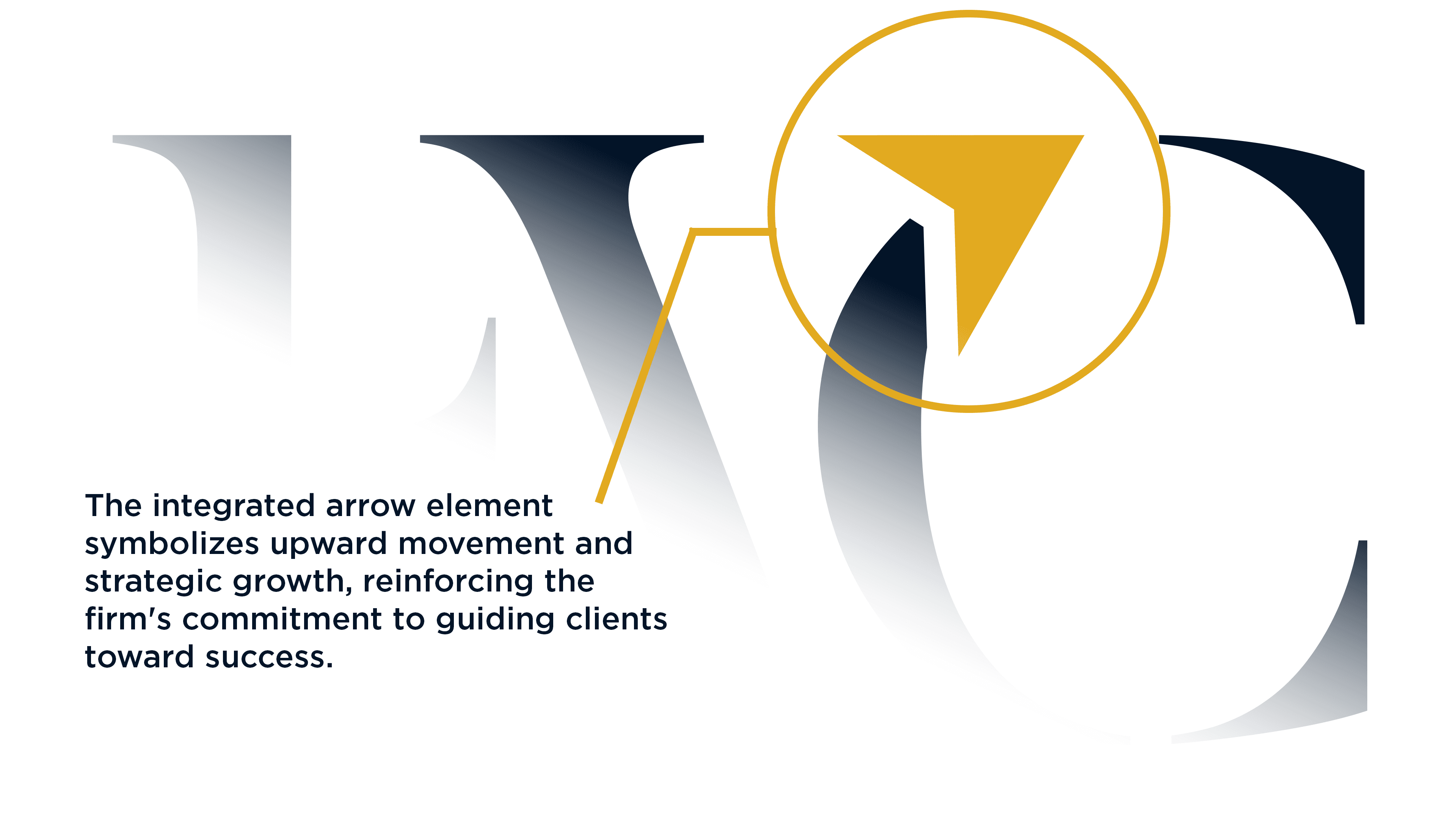
Interlocking the E, V and C gave me a clean, readable mark and nothing more. It described her name. It said nothing about her work. So instead of adding an element beside the letters, I looked at what the letters were already giving me. The C has a counter, an open pocket of negative space built into the shape. Placing the idea inside that pocket meant the meaning would be structural rather than applied. Nothing bolted on, nothing that needs a caption to work.
What went in the counter was an upward arrow, because that is the one thing both of her audiences are actually buying. A startup with no systems and a company with broken ones are asking the same question in two accents: move us up. The arrow let a single mark speak to both without splitting the brand into two voices. It also gave the monogram a direction, which is the difference between a set of initials and a mark that states a position.

The System
One idea, extended until it could run the entire brand.
An idea that only lives in the logo is a detail. I pulled the arrow back out of the C and built a repeating pattern from it for backgrounds, fills and collateral, then drew it as a standalone alternate icon for every place the full monogram would collapse: avatars, favicons, app tiles, anything small. Golden Grass gold against Nile Blue carries the palette, with Kashmir Blue and Blue Charcoal supporting it. Gold to read high-class, navy to read trustworthy. FreightBig Pro sets the display voice, Almarose handles everything else.
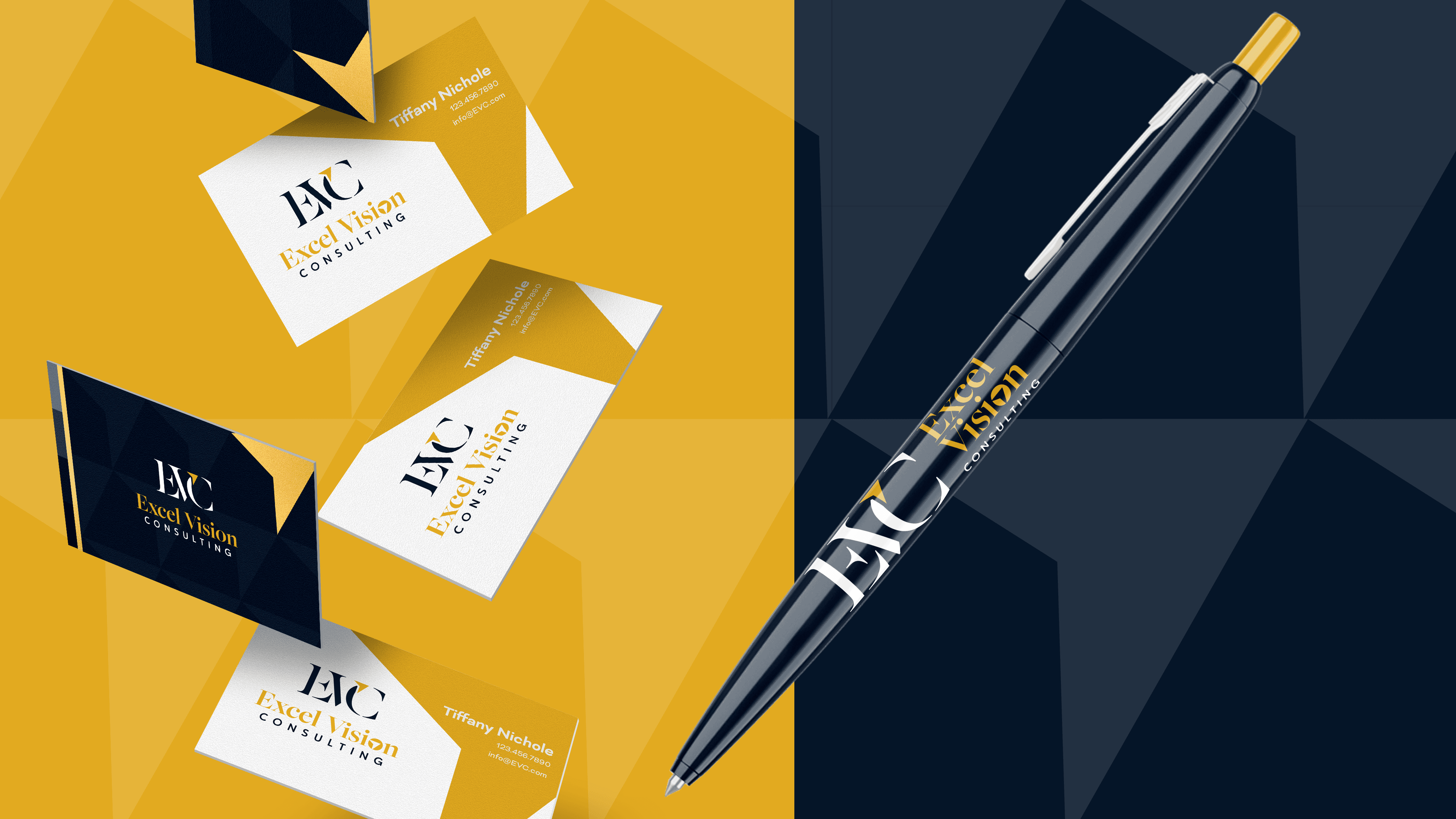
The delivery was built so nobody ever has to guess. The logo package runs 208 files: four configurations across five colorways, RGB and CMYK, web and print. The eleven page guideline documents clear space at 150 percent, a 16 pixel minimum size and thirteen specific misuse cases. On top of that sits the applied set she needed first: LinkedIn banner, quote template, business card, flyer, promotional flyer and social post, each one showing the system working rather than describing it.
None of that is thoroughness for its own sake. A solo founder eventually hires a printer, a web developer, a contractor to run her LinkedIn and someone to build a deck, and every one of them asks the same three questions. Which blue. Which font. How small can this go. Those answers are documented before anyone asks, so she hands over one PDF and gets back work that is her brand instead of somebody's interpretation of it.
What she owns is a finished business identity that was ready before day one. The mark holds from a billboard down to a favicon, the arrow pattern gives her marketing a texture that belongs to her and nobody else, and the collateral set covers the first pieces any consulting practice puts in front of a prospect.
More Works


FAQ
01
How much does it cost?
02
What is the process?
03
How do I know you're right for me?
04
Do you offer discounts or packages?
05
Is a deposit required?
06
How many revisions do I get?
07
What files do I receive?
08
Who owns the final files?
2025
Excel Vision Consulting
A consulting practice built to fix how other businesses run, branded before it had a single client to point to. With no track record yet, the identity had to carry the argument by itself.
Brand Identity
Consulting
Know More
She asked for a monogram. What she needed was a mark that could make her case before anyone had a reason to trust her.
The mark had to do the job a track record usually does.
Excel Vision Consulting came to me pre-launch, from a founder who had hired me before and came back after seeing my work through a friend I had worked for. She asked for a monogram: sleek, professional without being too serious, nothing complicated or hard to read.
That brief was easy to satisfy, which was exactly the problem with it. What she actually needed was a mark that made an argument on her behalf in the seconds before anyone had a reason to trust her. The whole identity turned on one decision: what to put inside the counter of the C.
Problem
She was selling structure to people who had never met her.
The practice targeted two groups that look different and want the same thing. Startups needed structure built from nothing. Established businesses needed structure that had stopped working fixed. Both hire a consultant on trust, and they extend that trust long before they can evaluate the actual work. She had no client list, no case studies and no referral engine yet. Her identity was not decoration on top of a business. For a while it was going to be the entire body of evidence.
Her brief asked for something clean and legible, and a straightforward interlocked EVC would have checked every box she wrote down. It also would have left her looking like any other consultant with three initials on a card. That is the trap in a monogram brief. Legible is not the same as memorable, and memorable is not the same as credible. A mark that only spells her name puts the entire burden of persuasion back on her, in every room, forever.
Concept
The arrow went where the letterform already had a hole.
Interlocking the E, V and C gave me a clean, readable mark and nothing more. It described her name. It said nothing about her work. So instead of adding an element beside the letters, I looked at what the letters were already giving me. The C has a counter, an open pocket of negative space built into the shape. Placing the idea inside that pocket meant the meaning would be structural rather than applied. Nothing bolted on, nothing that needs a caption to work.
What went in the counter was an upward arrow, because that is the one thing both of her audiences are actually buying. A startup with no systems and a company with broken ones are asking the same question in two accents: move us up. The arrow let a single mark speak to both without splitting the brand into two voices. It also gave the monogram a direction, which is the difference between a set of initials and a mark that states a position.
The System
One idea, extended until it could run the entire brand.
An idea that only lives in the logo is a detail. I pulled the arrow back out of the C and built a repeating pattern from it for backgrounds, fills and collateral, then drew it as a standalone alternate icon for every place the full monogram would collapse: avatars, favicons, app tiles, anything small. Golden Grass gold against Nile Blue carries the palette, with Kashmir Blue and Blue Charcoal supporting it. Gold to read high-class, navy to read trustworthy. FreightBig Pro sets the display voice, Almarose handles everything else.
The delivery was built so nobody ever has to guess. The logo package runs 208 files: four configurations across five colorways, RGB and CMYK, web and print. The eleven page guideline documents clear space at 150 percent, a 16 pixel minimum size and thirteen specific misuse cases. On top of that sits the applied set she needed first: LinkedIn banner, quote template, business card, flyer, promotional flyer and social post, each one showing the system working rather than describing it.
None of that is thoroughness for its own sake. A solo founder eventually hires a printer, a web developer, a contractor to run her LinkedIn and someone to build a deck, and every one of them asks the same three questions. Which blue. Which font. How small can this go. Those answers are documented before anyone asks, so she hands over one PDF and gets back work that is her brand instead of somebody's interpretation of it.
What she owns is a finished business identity that was ready before day one. The mark holds from a billboard down to a favicon, the arrow pattern gives her marketing a texture that belongs to her and nobody else, and the collateral set covers the first pieces any consulting practice puts in front of a prospect.
More Works
FAQ
01
How much does it cost?
02
What is the process?
03
How do I know you're right for me?
04
Do you offer discounts or packages?
05
Is a deposit required?
06
How many revisions do I get?
07
What files do I receive?
08
Who owns the final files?
2025
Excel Vision Consulting
A consulting practice built to fix how other businesses run, branded before it had a single client to point to. With no track record yet, the identity had to carry the argument by itself.
Brand Identity
Consulting
Know More
She asked for a monogram. What she needed was a mark that could make her case before anyone had a reason to trust her.
The mark had to do the job a track record usually does.
Excel Vision Consulting came to me pre-launch, from a founder who had hired me before and came back after seeing my work through a friend I had worked for. She asked for a monogram: sleek, professional without being too serious, nothing complicated or hard to read.
That brief was easy to satisfy, which was exactly the problem with it. What she actually needed was a mark that made an argument on her behalf in the seconds before anyone had a reason to trust her. The whole identity turned on one decision: what to put inside the counter of the C.
Problem
She was selling structure to people who had never met her.
The practice targeted two groups that look different and want the same thing. Startups needed structure built from nothing. Established businesses needed structure that had stopped working fixed. Both hire a consultant on trust, and they extend that trust long before they can evaluate the actual work. She had no client list, no case studies and no referral engine yet. Her identity was not decoration on top of a business. For a while it was going to be the entire body of evidence.
Her brief asked for something clean and legible, and a straightforward interlocked EVC would have checked every box she wrote down. It also would have left her looking like any other consultant with three initials on a card. That is the trap in a monogram brief. Legible is not the same as memorable, and memorable is not the same as credible. A mark that only spells her name puts the entire burden of persuasion back on her, in every room, forever.
Concept
The arrow went where the letterform already had a hole.
Interlocking the E, V and C gave me a clean, readable mark and nothing more. It described her name. It said nothing about her work. So instead of adding an element beside the letters, I looked at what the letters were already giving me. The C has a counter, an open pocket of negative space built into the shape. Placing the idea inside that pocket meant the meaning would be structural rather than applied. Nothing bolted on, nothing that needs a caption to work.
What went in the counter was an upward arrow, because that is the one thing both of her audiences are actually buying. A startup with no systems and a company with broken ones are asking the same question in two accents: move us up. The arrow let a single mark speak to both without splitting the brand into two voices. It also gave the monogram a direction, which is the difference between a set of initials and a mark that states a position.
The System
One idea, extended until it could run the entire brand.
An idea that only lives in the logo is a detail. I pulled the arrow back out of the C and built a repeating pattern from it for backgrounds, fills and collateral, then drew it as a standalone alternate icon for every place the full monogram would collapse: avatars, favicons, app tiles, anything small. Golden Grass gold against Nile Blue carries the palette, with Kashmir Blue and Blue Charcoal supporting it. Gold to read high-class, navy to read trustworthy. FreightBig Pro sets the display voice, Almarose handles everything else.
The delivery was built so nobody ever has to guess. The logo package runs 208 files: four configurations across five colorways, RGB and CMYK, web and print. The eleven page guideline documents clear space at 150 percent, a 16 pixel minimum size and thirteen specific misuse cases. On top of that sits the applied set she needed first: LinkedIn banner, quote template, business card, flyer, promotional flyer and social post, each one showing the system working rather than describing it.
None of that is thoroughness for its own sake. A solo founder eventually hires a printer, a web developer, a contractor to run her LinkedIn and someone to build a deck, and every one of them asks the same three questions. Which blue. Which font. How small can this go. Those answers are documented before anyone asks, so she hands over one PDF and gets back work that is her brand instead of somebody's interpretation of it.
What she owns is a finished business identity that was ready before day one. The mark holds from a billboard down to a favicon, the arrow pattern gives her marketing a texture that belongs to her and nobody else, and the collateral set covers the first pieces any consulting practice puts in front of a prospect.
More Works
FAQ
How much does it cost?
What is the process?
How do I know you're right for me?
Do you offer discounts or packages?
Is a deposit required?
How many revisions do I get?
What files do I receive?
Who owns the final files?